Showing posts with label logos. Show all posts

Wednesday, June 22, 2016

Toot, horn, etc.

(originally posted, like a year ago, updated and reposted to include "Metal smash")

Well, we don't usually like to toot our own horn, but being in the horn tooting business and all, and being the horn-tooting professionals that we are, don't'cha know, sometimes it just has to happen. Sure, that "sometimes" may sometimes seem like all the time, but that's just the way it is and if you can't handle the heat, well, get out of our car. Vrooom.

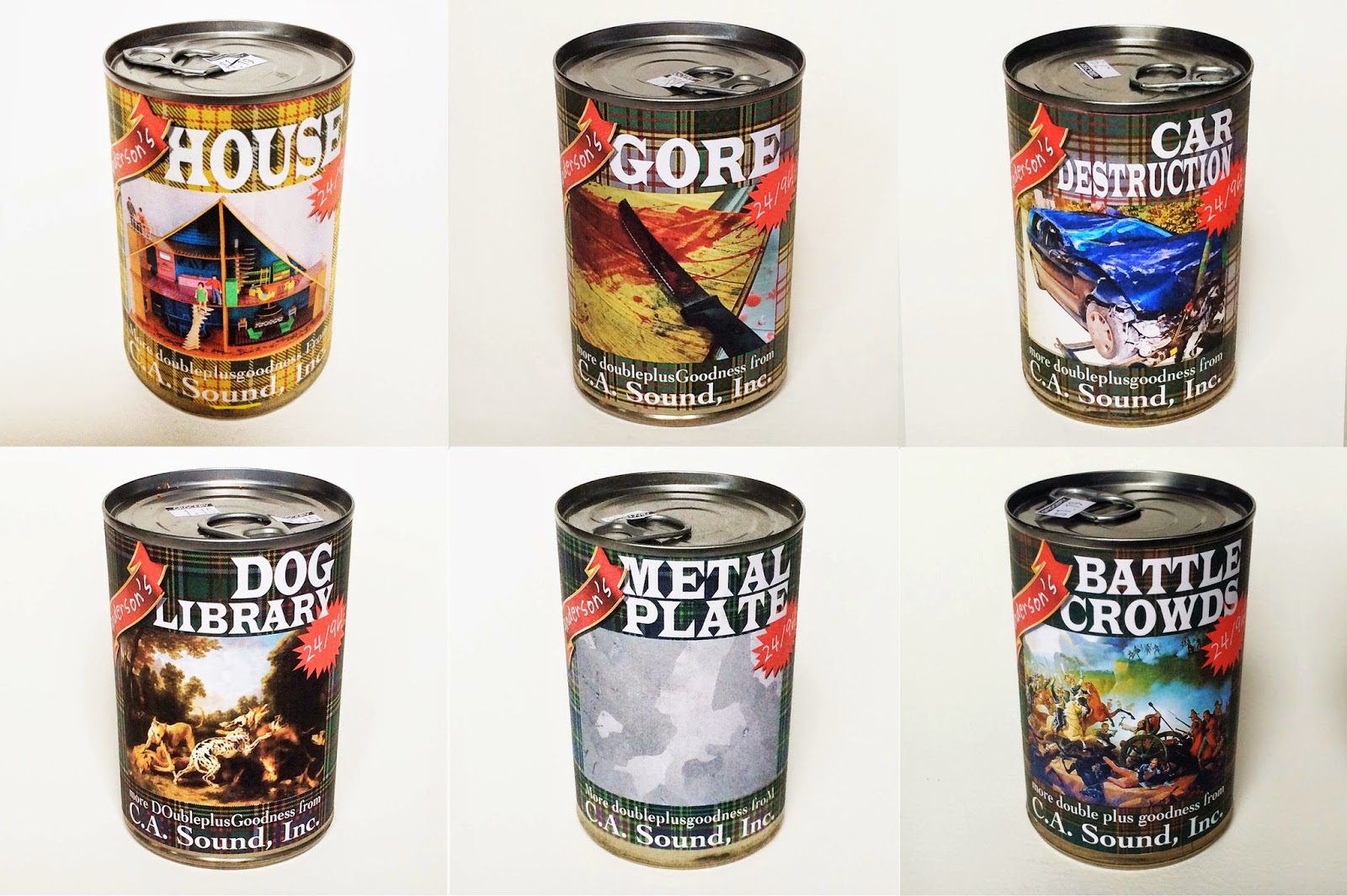
Anyhow, we got a job doing some labels for cd's put out by our professional horn toot sound effect pal, Coll, of C.A. Sound, Inc. He had some ideas that we kinda liked and all was going along well, happily making his ideas sing when, BAM!!, a completely different idea crashed into our skulls.

He's selling canned sound effects, sets of them, each one around a particular theme, so why not make the labels actual labels on actual cans. Get it?! For the canned sound effect? Uh huh, yeah you do. You get it. Well, so did our esteemed client. He loved the idea and so we made a bunch of actual labels and pasted them onto a bunch of actual cans and actually took an actual photo of it. And that's our cd cover. To date, we've done labels for cd sound effects libraries for metal smash, car destruction, house, gore, dog, metal plate and battle crowds. He's got more for us to to and when they're done, we'll post 'em here and honk our horn so you know when to look.


For "Metal smash", we made and affixed the label and then (of course) dented the can.
(We also designed his landing page, from which we stole the above image and which includes some of the favorite copy we ever wrote! You can see it here: http://casoundinc.com)


Thursday, November 12, 2015

We love doing logos; it's just like play.

We've come to understand something important: we looooove doing logos! So, here is an updated accounting of some of our work that actually seems like play in this arena and a short rant on the topic, to boot!!


BRANDING IS NOT A LOGO!!

More and more people are talking about "branding" these days and it's becoming increasingly apparent that what they're really talking about is a logo. Nothing more. It seems that, for many people, the idea of branding is kinda, well, superficial.

As long-time practitioners of what we used to call "positioning", this misperception irks us. Oh sure, maybe we shouldn't take it so personally, but we do. Which leads us to frequently say (or at least think) "harrumph!" and also leads us to frequently direct people to our most excellent and still-fun company white paper on branding. As we're doing right now: click here to read it.

But we've already written that paper. This one's on a different topic altogether: expressing the brand through the logo.


THE LOGO AS AN EXPRESSION OF THE BRAND

Oh, we love logos as expressions of a company's brand essence. Some of them are kinda literal in expressing it: think of the puma (symbol of speed and strength) for sportswear company Puma or the running greyhound (symbol of speed) for bus company Greyhound; others are a little more symbolically rich like the apple (symbol of knowledge ever since the garden of Eden) for computer company Apple. Others don't really reflect the brand essence but rather, the brand's name: the red target for big chain store Target, the red cross for the Red Cross, the aforementioned greyhound and the big yellow shell for the oil company named . . . anyone? Bueller? Still others really don't seem to relate to the brand name or the brand essence very much at all: the Nike swoosh, the Mercedes-Benz three pointed star and, say, the bat inside of a circle for Bacardi.

For us here at Woodstock Organic Concepts, however, the logos we like best actually have a meaningful connection to their brand's deliverables, if not the exact brand essence. Take a look through this random sampling of logos below and name the company they represent and what that company does.


Really, apart from that shell and the DHL logo, they all relate pretty closely to the goods or services they stand for.

So. So much for the classics made by other people. Some of them big famous hotshots. (We love that Westinghouse logo by Paul Rand and others, including Charles Eames.) What about the Woodstock Organic Concepts classics?

Well, there are some, and you're about to see them. Mostly, we do logos as part of an overall branding job, but sometimes we get a gig where the client understands their brand, already has a brand identity and simply wants a logo to express it. So, without further ado, here are are a few of our favorite logos from over the years and a short explanatory text (we'll try to keep it short, really we will) connecting the logo to the brand idea. Enjoy.

- - - - - - - - - - - - - - - - - - - - - - - - - - - - - - - - - - - - - - - - - - - - - - - - - - - - - - - - - - - -

THE WOODSTOCK PUBLIC LIBRARY

The Woodstock Public Library was a great gig, we helped them identify what they should stand for: access. The client wanted an iconic logo to express that thought and we gave them this:


Here's the logo with the tag line:


For the entire library branding case study, including a lot on logo development, click here.


ENERGY TRANSFORMATION GROUP

Another of our favorite logos is for a company that helps buildings to become more green. We visually showed the transformation from dirty to clean by using color stripes that ran from black to white and muddy to pastel. Again, it's fairly iconic and ownable.


PINKO RECORDS/THE JILL AND JULIA SHOW

Next up is a logo we did for singer/songwriter and all-around amazingly creative super star Jill Sobule. She wanted to start a record company where the profits would be in the hands of the artists, not the management. Naturally, we called her a communist, which nicely reinforced one of her ideas for the label's name: Pinko records. Naturally, we thought of the Chinese flag, with one big star and a red background. In this case, we made the star out of a vinyl record, had an actual flag made up, ran it up the hill on a windy day and shot a photo of it. Bam! Instant logo. Jill has the flag now and trots it out for various events.


Jill also needed a logo for her traveling show with SNL alum Julia Sweeney, a mini case study of that logo can be read here, and the finished product is here below:


VINTAGE VACUUM AUDIO

The logo below was done for a company that restores old tube amplifiers, stereo components. They specialize in MacIntosh amplifiers. We were messing around with the sound waves of oscilloscopes (a tool of his trade) and realized that the waves, if looked at just right made the letters of the company name, VVA, as well as representing the science behind the scene of the company's work.


BLUFUEL AND GYR

We did a couple of swell logos for a pair of energy companies, here are the selected logo and the runner up just underneath for both bluefuel and gyr:

PRESTON SCHLEBUSCH

For travel and destination photographers, Preston Schlebusch, citizens of the world that they are, we decided they needed their own flag:


But not just a photoshopped flag created from their images, oh no, they needed an actual 3d physical object flag for them to take with them as they travel all over the world shooting their jobs. And so that's what we made 'em. 

Here are some of the pics so far...


RADIO UNLEASHED

One of our very favorite branding case-studies is for a nationally syndicated radio program, radioUnleashed. (read it here.) The logo that came out of the brand exploratory continues to delight and the tag line ain't half bad either.


KOVO

For a new chain of Greek restaurants, here are some of the remaining contenders after a couple of rounds of a major logo exploratory. (Which will give a good glimpse into how we work!) (Kovo means "to slice" in Greek.)


YOUNG RHINEBECK - CULTURECONNECT

For the 501(c)3 youth organization, we did a complete rebranding. It's now called Culture Connect and the new logo is this: 

OTHERS

Another hand-drawn logo for another music business, a small record label in NYC that was putting out funky and fun music:


For the 1/2 a percent for AIDS charity meme:


For our friend the reflexologist, kinda explaining the concept of what she does. (We love the fingerprint in the shape of a brain.)


For a now defunct organization that helped kids by helping them make movies and short films. You can also see a fine example of our original concept: the "dynamic tag line":


Patches for the Farber Brothers' sailboat for hire, Ophira. They already had the Farber brothers emblem.


For the green candidate who was not seen as the green candidate: (read the case study here.)


For two organizations that help those exposed to toxic dust during the 9/11 clean up:


For Samuel's, the best coffee in Rhinebeck, this little 'king of coffee' logo was designed to be used in conjunction with the pre-existing Samuel's logo (which we always wanted to update):


And finally, for our own little fun company, we use a fresh logo whenever we come up with one, but that little light bulb is really our fave for expressing our brand personality: fun, creative, unusual. Just what you want in an ad agency.


There you go. A little logo round up showing hopefully, how logos can really be a strong way to express a brand essence and brand personality. Logos are important tool in the big branding tool box. But they're certainly not the only tool. So please, from now on, remember: branding is not a logo . . . but a logo should definitely be branding.


Wednesday, February 12, 2014

Logo smorgasbord

Well, the phone has actually been ringing a lot lately, everyone looking for a fun logo, leading us to get off of our winter butts and update our little logo smorgasbord file. Some new, some old, all of them right on strategy. Need one for your company? Call ours.

(and don't forget to read our little rant below on logos vs. branding!)


Sunday, December 8, 2013

Branding is not a logo.

More and more people are talking about "branding" these days and it's becoming increasingly apparent that what they're really talking about is a logo. Nothing more. It seems that, for many people, the idea of branding is kinda, well, superficial.

As long-time practitioners of what we used to call "positioning", this misperception irks us. Oh sure, maybe we shouldn't take it so personally, but we do. Which leads us to frequently say (or at least think) "harrumph!" and also leads us to frequently direct people to our most excellent and still-fun company white paper on branding. As we're doing right now: click here to read it.

But we've already written that paper. This one's on a different topic altogether: expressing the brand through the logo.


THE LOGO AS AN EXPRESSION OF THE BRAND


Oh, we love logos as expressions of a company's brand essence. Some of them are kinda literal in expressing it: think of the puma (symbol of speed and strength) for sportswear company Puma or the running greyhound (symbol of speed) for bus company Greyhound; others are a little more symbolically rich like the apple (symbol of knowledge ever since the garden of Eden) for computer company Apple. Others don't really reflect the brand essence but rather, the brand's name: the red target for big chain store Target, the red cross for the Red Cross, the aforementioned greyhound and the big yellow shell for the oil company named . . . anyone? Bueller? Still others really don't seem to relate to the brand name or the brand essence very much at all: the Nike swoosh, the Mercedes-Benz three pointed star and, say, the bat inside of a circle for Bacardi.

For us here at Woodstock Organic Concepts, however, the logos we like best actually have a meaningful connection to their brand's deliverables, if not the exact brand essence. Take a look through this random sampling of logos below and name the company they represent and what that company does.


Really, apart from that shell and the DHL logo, they all relate pretty closely to the goods or services they stand for.

So. So much for the classics made by other people. Some of them big famous hotshots. (We love that Westinghouse logo by Paul Rand and others, including Charles Eames.) What about the Woodstock Organic Concepts classics?

Well, there are some, and you're about to see them. Mostly, we do logos as part of an overall branding job, but sometimes we get a gig where the client understands their brand, already has a brand identity and simply wants a logo to express it. So, without further ado, here are are a few of our favorite logos from over the years and a short explanatory text (we'll try to keep it short, really we will) connecting the logo to the brand idea. Enjoy.

- - - - - - - - - - - - - - - - - - - - - - - - - - - - - - - - - - - - - - - - - - - - - - - - - - - - - - - - - - - -

THE WOODSTOCK PUBLIC LIBRARY

The Woodstock Public Library was a great gig, we helped them identify what they should stand for: access. The client wanted an iconic logo to express that thought and we gave them this:


Here's the logo with the tag line:


For the entire library branding case study, including a lot on logo development, click here.


ENERGY TRANSFORMATION GROUP

Another of our favorite logos is for a company that helps buildings to become more green. We visually showed the transformation from dirty to clean by using color stripes that ran from black to white and muddy to pastel. Again, it's fairly iconic and ownable.


PINKO RECORDS/THE JILL AND JULIA SHOW

Next up is a logo we did for singer/songwriter and all-around amazingly creative super star Jill Sobule. She wanted to start a record company where the profits would be in the hands of the artists, not the management. Naturally, we called her a communist, which nicely reinforced one of her ideas for the label's name: Pinko records. Naturally, we thought of the Chinese flag, with one big star and a red background. In this case, we made the star out of a vinyl record, had an actual flag made up, ran it up the hill on a windy day and shot a photo of it. Bam! Instant logo. Jill has the flag now and trots it out for various events.


Jill also needed a logo for her traveling show with SNL alum Julia Sweeney, a mini case study of that logo can be read here, and the finished product is here below:


VINTAGE VACUUM AUDIO

The logo below was done for a company that restores old tube amplifiers, stereo components. They specialize in MacIntosh amplifiers. We were messing around with the sound waves of oscilloscopes (a tool of his trade) and realized that the waves, if looked at just right made the letters of the company name, VVA, as well as representing the science behind the scene of the company's work.


SUNFROST FARMS

An oldie, but a goodie, was this logo we did for our local farm stand, Sunfrost Farms. Our thought was so simple: update the classic fruit carton label. Below is our logo and tag line as well as a few mock-ups of business card backs.


RADIO UNLEASHED

One of our very favorite branding case-studies is for a nationally syndicated radio program, radioUnleashed. (read it here.) The logo that came out of the brand exploratory continues to delight and the tag line ain't half bad either.


OTHERS

Another hand-drawn logo for another music business, a small record label in NYC that was putting out funky and fun music:


For the 1/2 a percent for AIDS charity meme:


For our friend the reflexologist, kinda explaining the concept of what she does. (We love the fingerprint in the shape of a brain.)


For a now defunct organization that helped kids by helping them make movies and short films. You can also see a fine example of our original concept: the "dynamic tag line":


Patches for the Farber Brothers' sailboat for hire, Ophira. They already had the Farber brothers emblem.


For the green candidate who was not seen as the green candidate: (read the case study here.)


For two organizations that help those exposed to toxic dust during the 9/11 clean up:


For Samuel's, the best coffee in Rhinebeck, this little 'king of coffee' logo was designed to be used in conjunction with the pre-existing Samuel's logo (which we always wanted to update):
And finally, for our own little fun company, we use a fresh logo whenever we come up with one, but that little light bulb is really our fave for expressing our brand personality: fun, creative, unusual. Just what you want in an ad agency.


There you go. A little logo round up showing hopefully, how logos can really be a strong way to express a brand essence and brand personality. Logos are important tool in the big branding tool box. But they're certainly not the only tool. So please, from now on, remember: branding is not a logo . . . but a logo should definitely be branding.